Svelte
Introduction
Svelte is a component framework built by Rich Harris. Svelte is different to most other frameworks, because instead of "diffing" the DOM, it compiles your code into efficent code that directly manipulates the DOM (Harris, 2019).
How it works
When trying out Svelte, I went to their website, which had an interactive tutorial to learn how Svelte's single file components work. I found this to be very helpful.
I installed the default app from their website, which looked nothing like what I had just been learning, so I had to research into why there was pages that begun with plus symbols. It turns out they are how Svelte knows which components are routable. The pages don't have to be added to a list of routes anywhere, they're automatically picked up by the plus prefix, and then you can just navigate to the folder's path. The default Svelte app's entry point is app.html, which is in the src folder, the content of the body is injected into a div in the body specified by a Svelte variable called %sveltekit.body%.
The components can have a script, style and HTML section, allowing for the HTML, CSS and JavaScript to be in the same file. The style is scoped to the component, so it doesn't affect the rest of the page, which can be useful if you don't live by the philosophy of reusing styles across components. When you reference a component, it looks like a custom HTML tag with the properties passed in as attributes.
Figure 6
Svelte Logo

(Wikimedia Commons, 2019).
Strengths and Weaknesses
Strengths
-
Svelte is a compiler, which means that it can be faster than a framework that uses a virtual DOM (Harris, 2019).
-
Svelte is small, and it is easy to understand.
-
Components can have their own style, which is scoped to the component.
-
Routed components are automatically picked up, so you don't have to add them to a list of routes.
-
Referenced components are structured like HTML tags, which makes it easy to understand.
Weaknesses
-
There is a learning curve to get used to the syntax, and the way Svelte works.
-
The default app from the Svelte website is confusing to use.
-
The community is smaller, so there might not be as many resources available.
Example Web App
I found Svelte to be simple to understand, but the syntax complex to learn. For example, the components you want routed have to be called +page.svelte inside a folder you want the route to be called. To create a template that all the pages can use, you have to create a +layout.svelte file, which can then be overriden by a +layout.svelte file in the folder of the page you want to override it for. The slot tag defines where the content of the page will be injected, so you can't have the navbar above the page title and below the page content if they are both in the actual +page.svelte file.
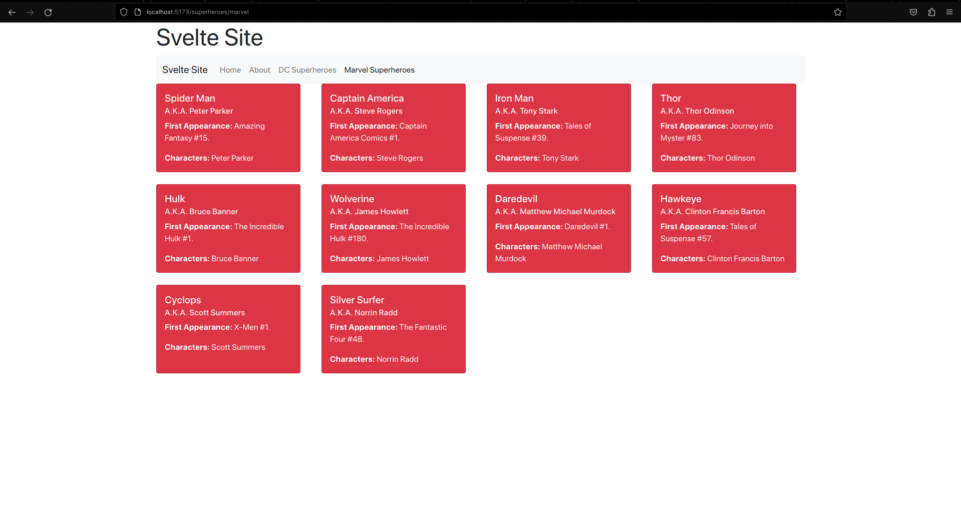
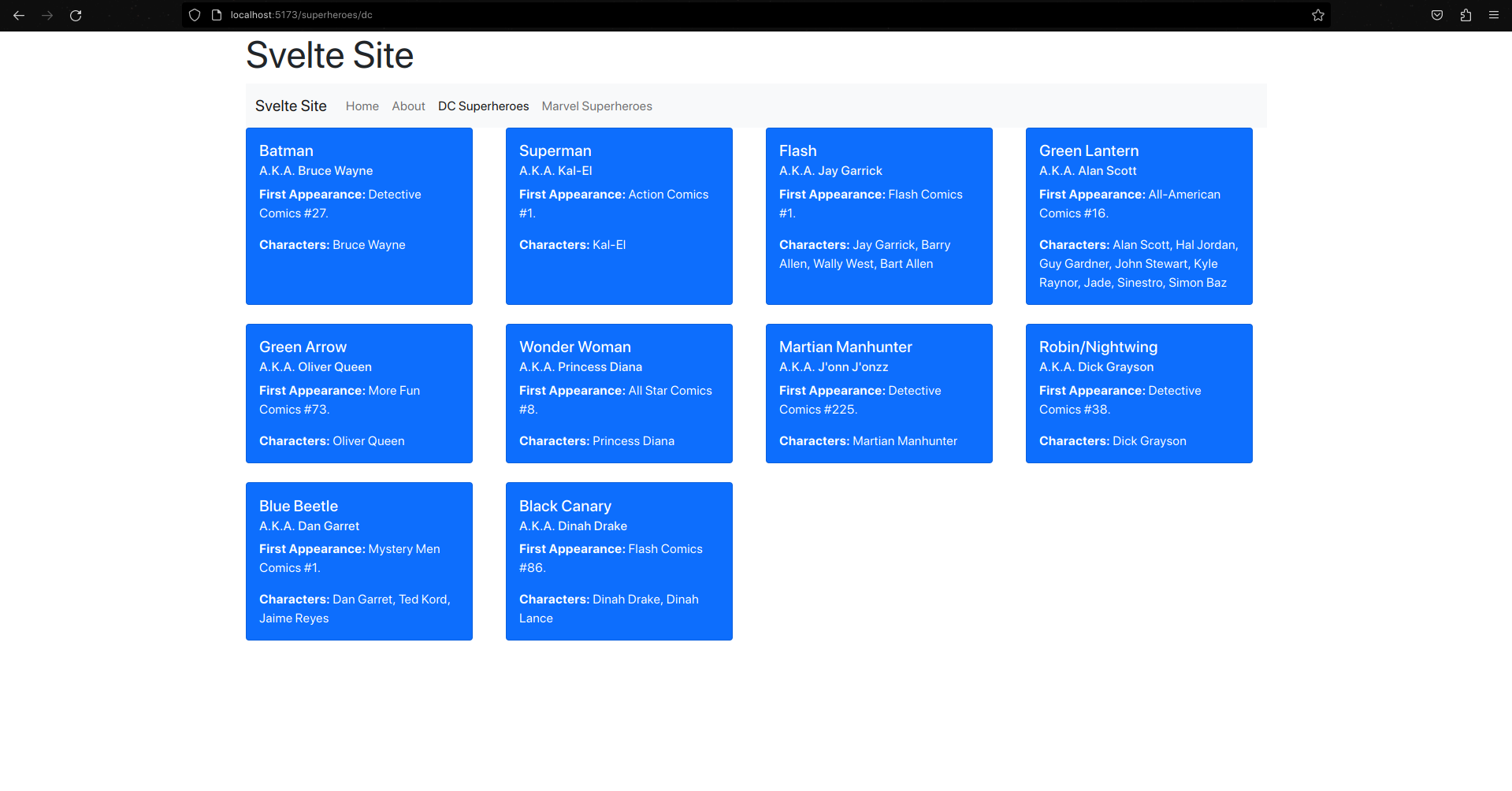
For this framework I made a basic site that has routing, and two pages that have their content generated by sub-components that take in props and display information from a JSON file. The JSON contains data about DC and Marvel superheroes, and I use a component to generate a grid of cards that filter the type of publisher (Marvel or DC) and that component uses another to create a card with the information about the superhero and either a blue or red background depending on the publisher.
As shown below, albeit out of order, the +layout.svelte, which I use to display the header and navigation bar, the index +page.svelte, which contains the content for the home page, and the +page.svelte for both the DC and Marvel pages, which are inside their own folders inside of a superheroes folder. They both import a component called CardGrid, which is used to generate the grid of cards, and in the script tag, the props for the publisher and publisher colour (which defines the colour of the cards) are passed in. This is demonstrated in the next file, CardGrid.svelte, which creates a card grid and creates the cards inside for each superhero in the JSON file if they match the correct publisher, using the HeroCard component. The HeroCard component takes in many props, which are defined by the superhero entry from the JSON file, which are then displayed in heading and paragraph tags in the card. The publisher colour is used to set the background colour of the card.
Gallery
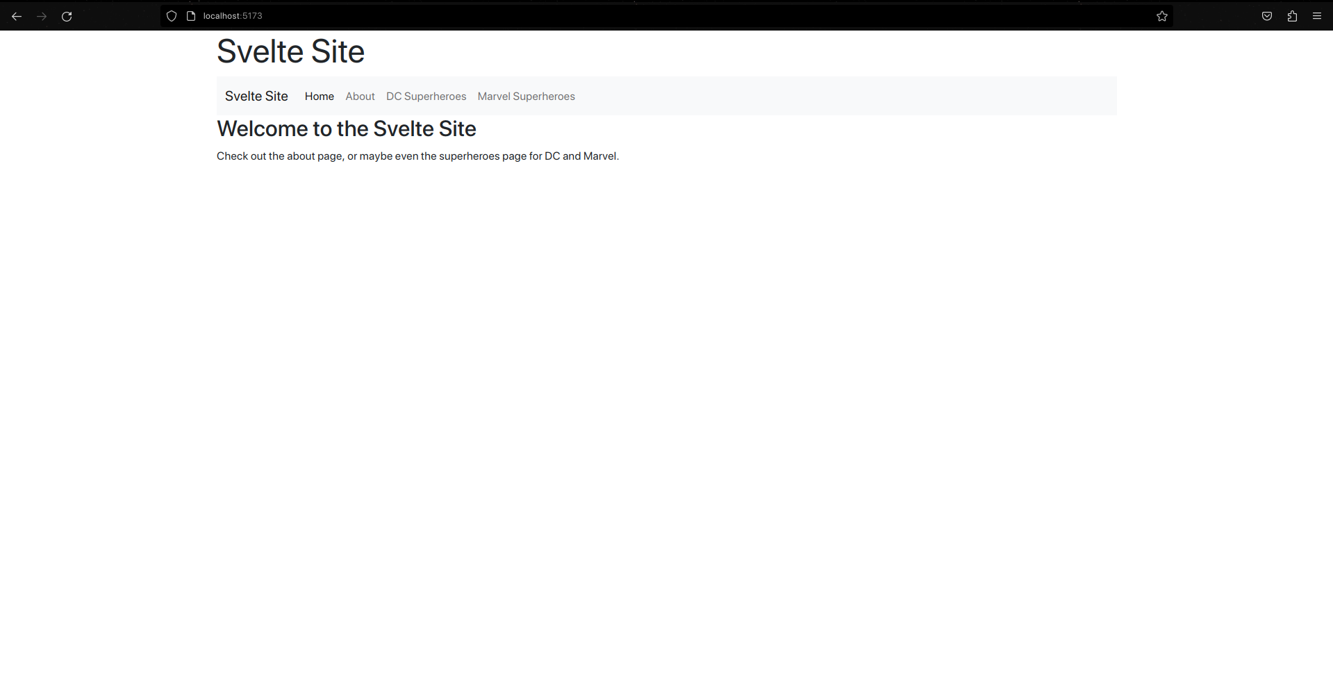
The Home Page
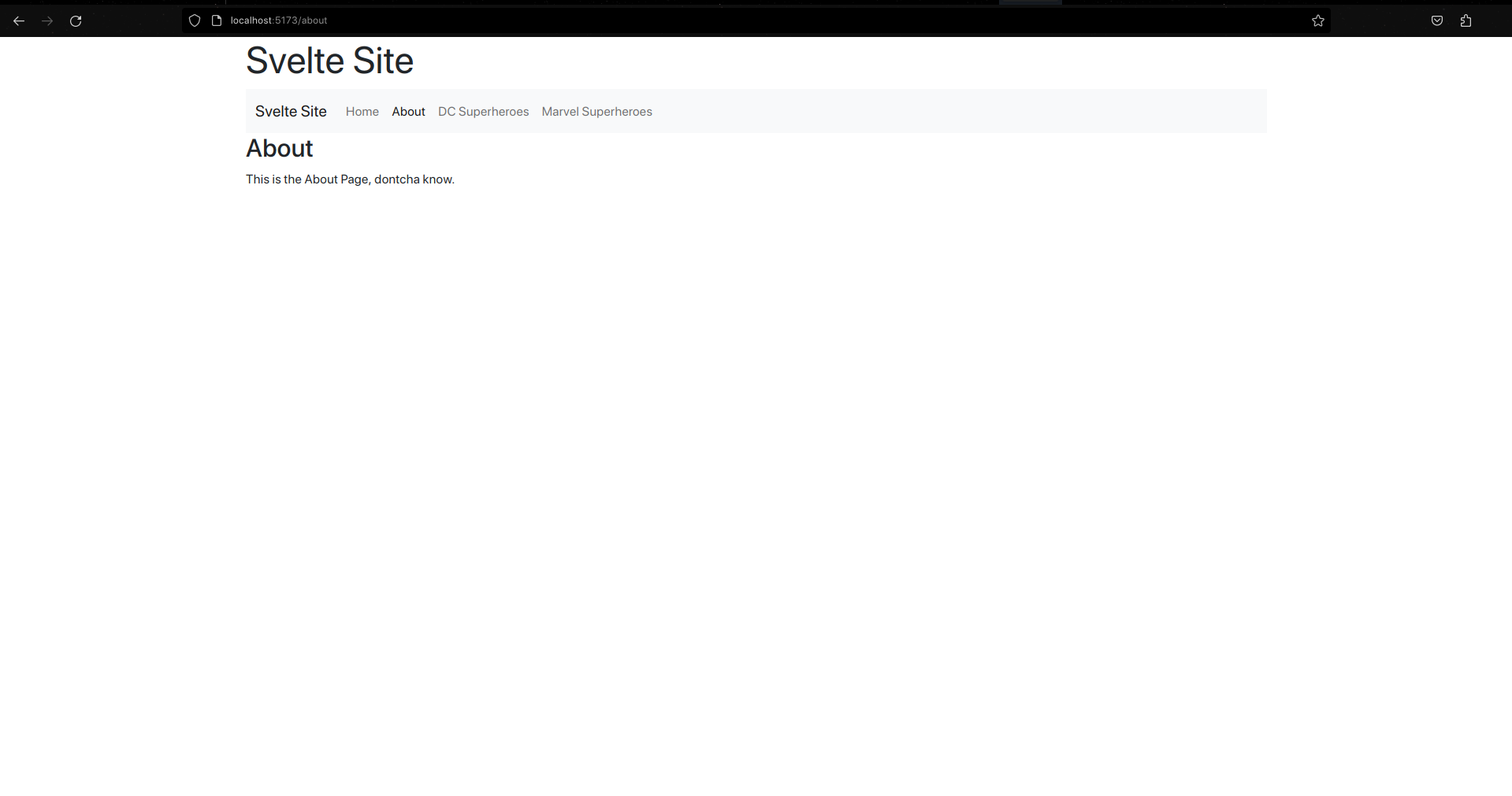
The About Page
The DC Superheroes Page
The Marvel Superheroes Page